<mwc-circular-progress> 
IMPORTANT: The Material Web Components are a work in progress and subject to
major changes until 1.0 release.
Progress indicators express an unspecified wait time or display the length of a
process.

Material Design Guidelines: Progress Indicators
Demo
Example usage
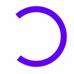
Determinate

<script type="module">
  import '@material/mwc-circular-progress';
</script>
<mwc-circular-progress progress="0.7"></mwc-circular-progress>
Indeterminate
<mwc-circular-progress indeterminate></mwc-circular-progress>
Styled
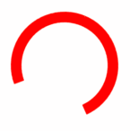
<style>
  mwc-circular-progress {
    --mdc-theme-primary: red;
  }
</style>
<mwc-circular-progress indeterminate></mwc-circular-progress>
API
Slots
None
Properties/Attributes
| Name | Type | Default | Description |
|---|
indeterminate | boolean | false | Sets the circular-progress into its indeterminate state. |
progress | number | 0 | Sets the progress bar's value. Value should be between [0, 1]. |
density | number | 0 | Sets the progress indicator's sizing based on density scale. Minimum value is -8. Each unit change in density scale corresponds to 4px change in side dimensions. The stroke width adjusts automatically. |
closed | boolean | false | Sets the progress indicator to the closed state. Sets content opacity to 0. Typically should be set to true when loading has finished. |
Methods
| Name | Description |
|---|
open() => void | Sets CircularProgress.closed to false; |
close() => void | Sets CircularProgress.closed to true; |
Events
None
CSS Custom Properties
| Name | Default | Description |
|---|
--mdc-circular-progress-track-color | transparent | Sets the track color of the determinate progress bar. |
Global Custom Properties
This component exposes the following global theming
custom properties.
| Name | Description |
|---|
--mdc-theme-primary | Sets the color of primary progress bar. |


